A Journey Into Ukiyo-e:
Museum of Fine Arts, Boston
View items
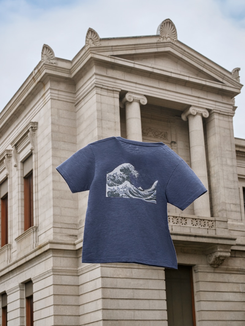
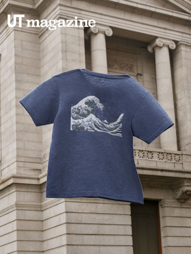
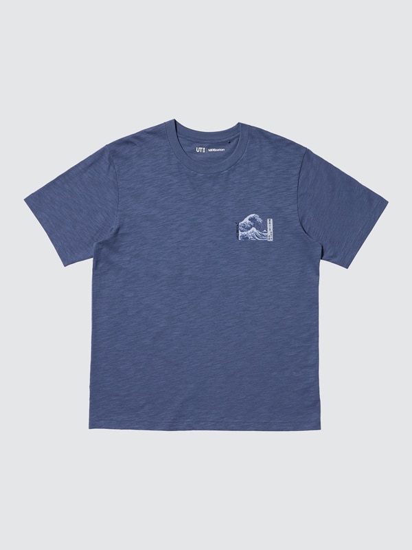
Under the Wave off Kanagawa (Ukiyo-e Blue)
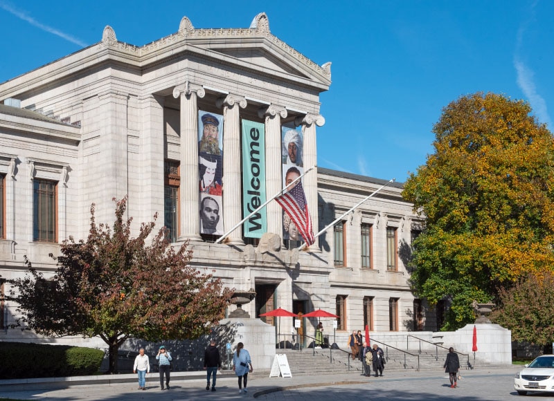
Founded in 1870, Museum of Fine Arts, Boston relocated to the current location in 1909. Designed by Boston architect Guy Lowell, the Beaux Arts style façade is home to over 500,000 works, from prehistoric to contemporary. “The Great Wave”by Katsushika Hokusai is one of the most well-known Ukiyo-e prints at the MFA Boston.
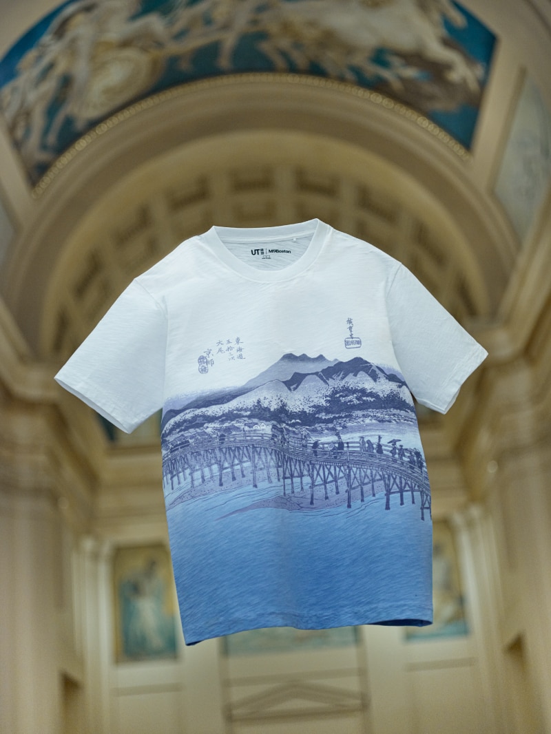
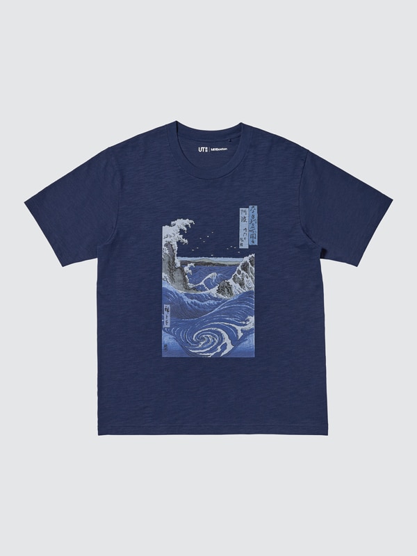
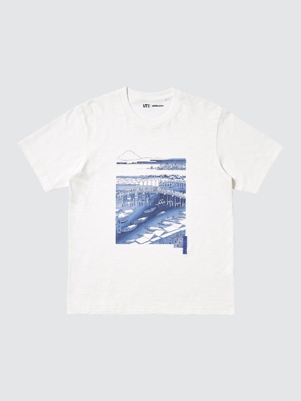
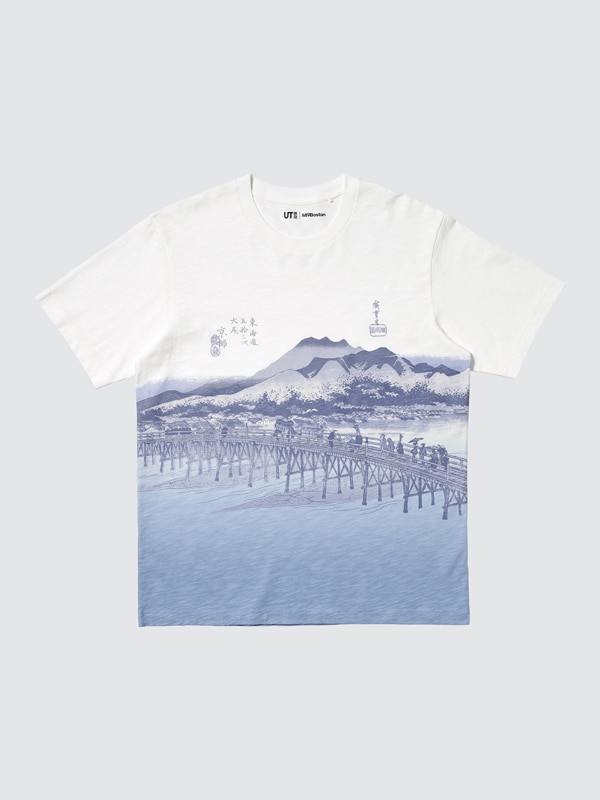
Kyoto: The Great Bridge at Sanjo (Ukiyo-e Blue)
One image was often printed in multiple color variations, as seen in the depth of the MFA Boston’s Ukiyo-e collection. Utagawa Hiroshige’s landscapes, with their subtle gradations of Prussian Blue, leave a particularly strong impression. Here in the museum’s entrance hall, Hiroshige’s Kyoto: The Great Bridge at Sanjo from the series Fiftythree Stations of the Tōkaido, quietly resonates with the blue tones of John Singer Sargent’s murals overhead.
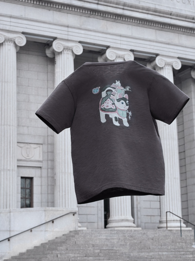
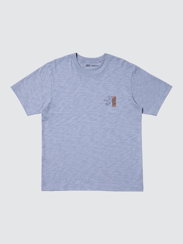
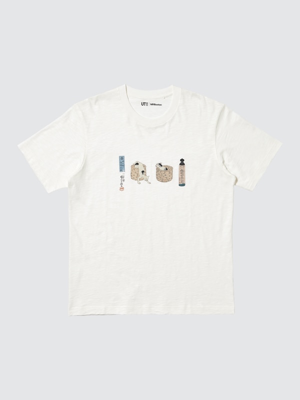
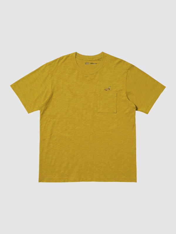
The War of Cats and Mice (Ukiyo-e Animals)
An ukiyo-e print by Tsukioka Yoshitoshi depicts a mouse commander astride a large toy dog, trapping them in paper snack bags, leading his forces into battle, as outmatched cats scramble to retreat. Behind the museum’s main entrance, its magnificent neoclassical architecture comes into view.
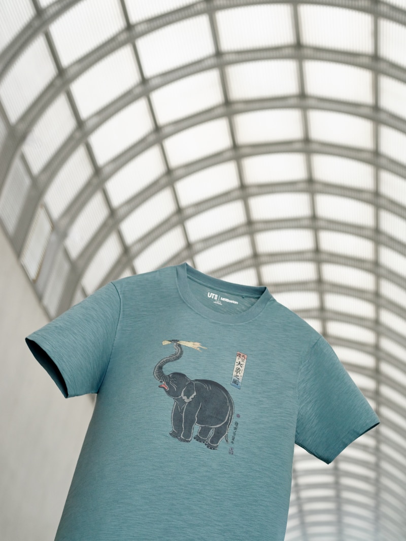
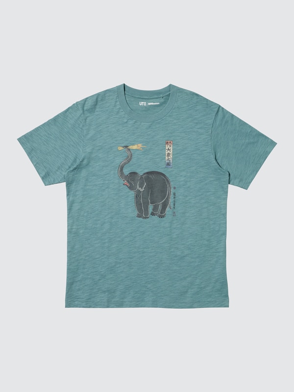
The Great Elephant from India (Ukiyo-e Animals)
Renowned for his depictions of animals, Ichiryusai Yoshitoyo (also known as Utagawa Yoshitoyo) portrays an elephant—rare in Japan at the time—with both raw power and playful charm. Displayed in the light-filled, modern space of the museum’s new wing designed by Norman Foster, the work brings together past and present.
Behind the Scenes: Ukiyo-e at the MFA Boston
The rare sighting of the best imprint of the 7 of Hokusai's "The Great Wave" that the MFA Boston’s holds in its collection.
Beloved as a form of popular culture during Japan’s Edo period, ukiyo-e traveled across the seas in the 19th century and spread around the world, where it was collected by art enthusiasts. Museum of Fine Arts, Boston holds one of the world’s leading ukiyo-e collections in terms of both quality and scale. Guided by curators, conservators, and researchers dedicated to ukiyo-e, this feature takes you behind the scenes of the museum. Alongside these rare works, we uncover the untold stories of color.
The hidden story of Ukiyo-e Blue
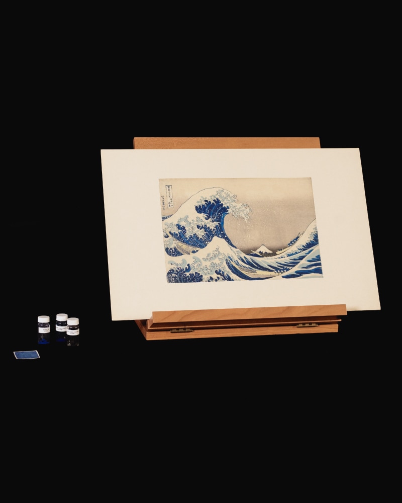
“Did you know that the earliest prints in Thirty-six Views of Mount Fuji by Katsushika Hokusai were all blue at first?” Joan Wright, Bettina Burr Conservator Emerita, draws us into the world of Ukiyo-e blue, by carefully placing 2 impressions of Kajikazawa in Kai Province side by side. Here in both images, the fisherman casts his line into the water from the protruding piece of vegetated rock, capturing the fine tension of the moment. The earlier print is rendered entirely in shades of blue, and the other is a multi-colored impression. “The sole use of blue evokes the quietude of early morning perfectly. The colored version feels more like afternoon, and its varied colors create compositional depth with a spotlight on Mount Fuji. This is just my interpretation, but the way colors are used in a print can really affect the mood of the image.” The colored series of Views of Mount Fujis was later, but the earlier edition in Prussian Blue was likely an outcome of “a craze for Prussian blue’s novelty at that point in time” explains Joan. Known as Aizuri-e, impressions entirely printed in blue are a popular genre of their own. Suggesting a surprisingly modern design sense, these blue images were first embraced in fan prints by Keisai Eisen, who was a contemporary of Hokusai’s. “Shortly after Eisen’s blue images came out, Hokusai starts to use that blue, designing the whole series Thirty-six Views of Mount Fuji to be printed in blue. It was an exciting way to celebrate the introduction of Prussian Blue into the printer’s palette”
The Great Blue by Hokusai
The latest UT collection takes its focus on this Ukiyo-e blue. Perhaps the most beloved print of all time, Hokusai’s “The Great Wave” also features the blue in a prominent way. The layers and textures of the waves, the slope of Mount Fuji in the background and the robes of men – when you step in and look closely, you will be rewarded by noticing the array of blue tones used in this renowned piece. “We have 7 impressions of Under the Wave off Kanagawa (lovingly known more commonly as “The Great Wave”) in our collection, and today we brought out the best conditioned print for your viewing. ”The Curator of Japanese Prints Sarah Thompson, proclaims with infectious excitement, and the artwork naturally commands the attention of everyone in the room. “With the largest collection outside of Japan, the Ukiyo-e collection at the MFA Boston has over 50,000 works and some of them are multiple impressions. One of our tasks, which constantly continues to this day,is to catalog the vast amount of art in the collection, and we work closely with Conservators like Joan. On top of that, her special dedication to Ukiyo-e Colorant Research (which started in 1999), exploring the materials and methods of colors in Japanese woodblock prints, makes her point of view regarding colors especially profound. Perhaps now, let’s talk about the color blue with Conservators.”
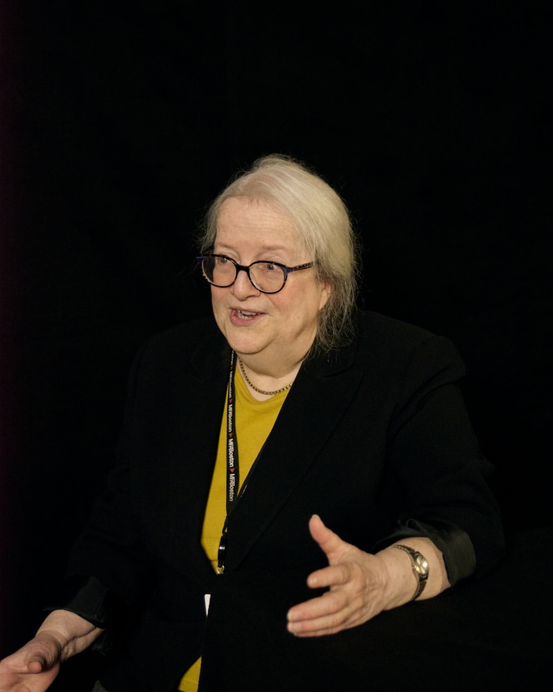
Sarah Thompson, the Curator of Japanese Prints.
The Progression of Blue
“Looking at the prints from around 1805, we found that two blues were used. One was dayflower, collected from the petals of the spiderwort family plants, and the other was indigo. Each has its own unique characteristics. dayflower blue is grayish and highly water soluble. Although this feature made it easy to print, it can be easily disturbed by water or humidity. When damaged, the original color can shift to a sickly greenish/yellow tone. In fact, Yuzen dyers traditionally used dayflower blue to apply the pattern guide onto fabric; once dyed, the faint blue lines could be washed away from the completed textile. Indigo offers a dark to light blue that can have green undertones. It was known to be difficult to print because of its coarseness in pigment form, but in the hands of a skilled printer, an even area of color could be achieved. When viewed side by side in our sample colors, you can almost detect a purplish hue to dayflower blue (by the way, the purple most popularly used in Ukiyo-e prints can only be achieved by combining dayflower and benibana, the fluorescent pink colorant derived from the safflower). Prussian blue, the first chemically synthesized color, was discovered in Germany in the early 18th century. In Europe, it was widely used for both oil painting and watercolor. When Prussian blue was introduced into Japan by the late 18th century, it was expensive. Since Ukiyoe prints were an inexpensive, popular, massproduced art form, Prussian blue was considered too expensive to be used for printing. Fortunately, by the mid 1820s, the price dropped, probably because it was produced in Asia as well as Europe, so it became economically viable for printing. One of the first Ukiyo-e artists to use Prussian blue in prints was Eisen. It eventually became the most commonly used blue for printing. The stability and versatility of Prussian blue offered a new blue that could be used to depict water, sky and other elements of an image. Perhaps Hokusai’s “The Great Wave” became what it is today because of this revered blue's ability to print many values from dark to light. “For me, the variety of blue values that this pigment can achieve is seductive and lyrical” remarks Joan. “The ways that printers manipulated it on the block prior to printing was so successful that Aizuri-e possess the quality of fine grain black and white photographs.”
Origins of Colors
Ukiyo-e Colorant Research became Joan’s life work; one can imagine the special excitement blue invokes in her cadence and voice. “As conservators we are responsible for the care of the collection, so we are always mindful of condition, storage and its constant upgrading.Our work centers around curated shows in-house and traveling exhibitions and with the ongoing care of this vast collection, we are kept quite busy. My passion is printed color. I studied Italian Chiaroscuro and French Mezzotint and being interested in the different ways color could be registered, I was especially interested in Japanese prints. I thought the registration system using the kento or key cut into the side of the block was very elegant. How the key cut into blocks made printing efficient and how color was manipulated on the block by the printer was especially fascinating. In the literature, there was a prescribed set of colors that the printers were said to have used. But what I really wanted to know was what were the actual materials used to make those colors. There was not much published analysis so whenever I travelled to Tokyo, I would visit the dye shops and purchase the dye stuff raw plantdye materials purported to be used in Japanese prints. Working with chemistry students, we formulated colors from this material and printed them to be used as references.”Eventually, this lead to collaborating with Michele Derrick in the Museum’s Scientific Research Department. Michele analyzed them and the results are now used to identify the colors on actual prints. Michiko Adachi, the current Bettina Burr Associate Conservator, initially worked under Joan’s wing as a graduate fellow. She is also carrying the Ukiyo-e Colorant Research into the future working closely with Wright, who recently retired from her Museum’s official post.
Michiko is currently documenting the production of the raw materials that were used for color printing during the Edo period by visiting the few existing producers in Japan. Here is her description of the manufacture of dayflower blue: The flower blooms in the early morning, and farmers collect the blue petals. Its delicate blue is easy to oxidize, and they process in carefully, massaging the petals in water. Once the intensity they want is achieved, they will take a piece of Japanese paper and let the color absorb onto it by painting repeatedly. This poetic cultivation of Dayflower color is a dying practice yet still exists today through a trickle of farmers and NPO groups in Japan. “To understand the color and how it’s made, it is an important part of research to visit the producers and learn from them directly” affirms Michiko.
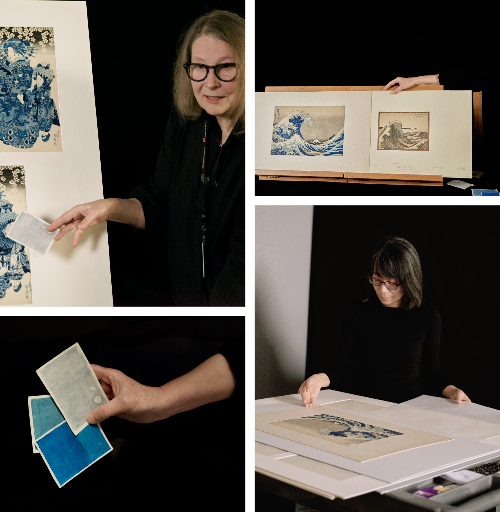
Upper left: Conservator Joan Wright points to Utagawa Kunisada’s Series of courtesans printed in blue. Lower left: (from top) dayflower, indigo and Prussian blue color samples made for the Ukiyo-e Colorant Research. Upper right: Hokusai’s study of wave compositions also showcases the stark contrast of Prussian blue in “The Great Wave” and dayflower blue seen in Express Delivery Boats Rowing Through Waves. Lower left: Michiko today carries the Colorant Research into the future.
Carrying forward the legacy of Ukiyo-e
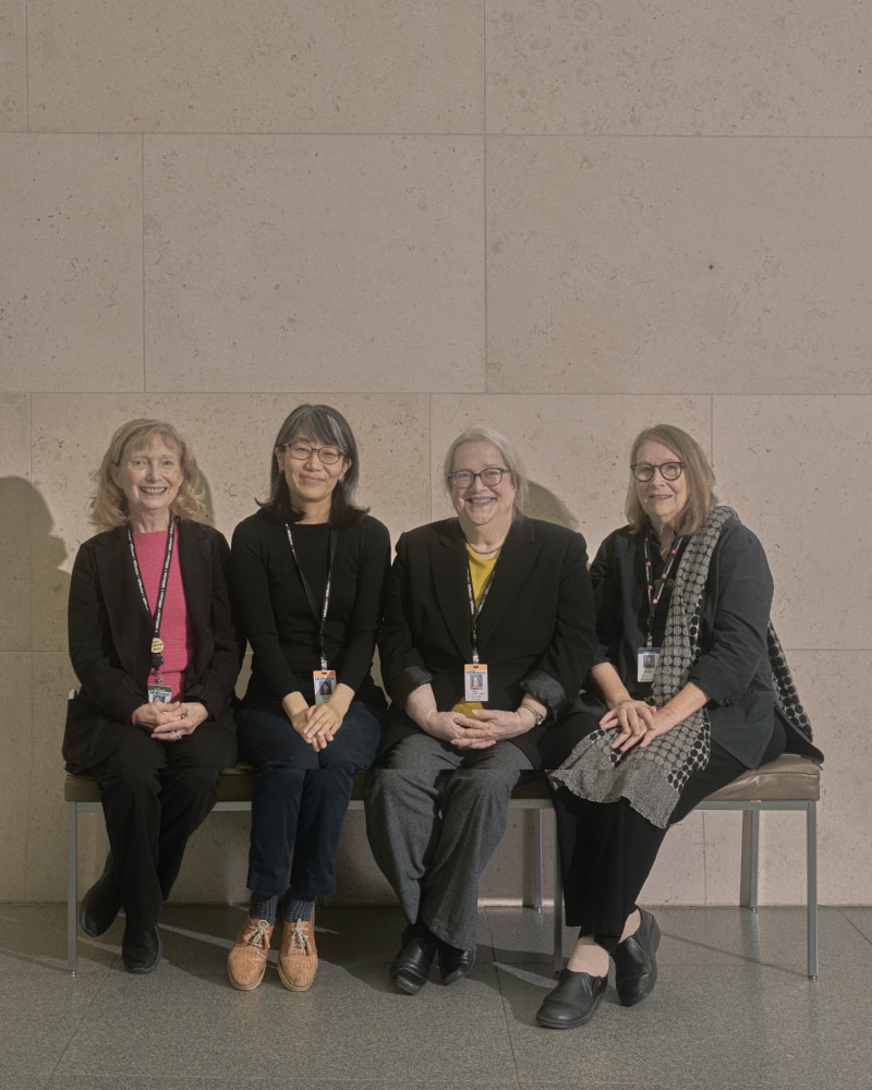
Guardians of Ukiyo-e
Our behind the scenes visit was guided by (from left) Research Scientist Michele Derrick, Conservator Michiko Adachi, Curator of Japanese Prints Sarah Thompson, and Conservator and founder of the Ukiyo-e Colorant Research Joan Wright. Michele and Joan are recently retired from official museum posts, but they continue to dedicate their focus into the research today. As Joan puts it, “our passion drives our work” the world-renowned Ukiyo-e collection is preserved and shared by these sure and careful hands. In recent years, The MFA Boston consulted with Rijksmuseum in Amsterdam to establish their own colorant research program, and through online database CAMEO, home to the Ukiyo-e Print Colorant Database, The MFA Boston has been generously sharing the state-of-the-art research findings to scholars and the public since 1999.
Exploring the power of color
“Let’s take a look at Suzuki Harunobu’s Beauties of Yoshiwara from 1770. Harunobu is the first artist to design prints that were printed in full color (known as “Nishiki-e”). These volumes are a great way to explore what was going on in the early printing. We think of these books as a playground of color–through research we found that they were mixing many different colorants.” As Joan carefully opens the pages, her protégé and the current conservator Michiko adds to the discovery. “In the earlier volumes, they were mixing different yellows and blues to create the greens. But as it goes into later volumes, we saw that they have established a palette which consisted of just indigo and orpiment. So, you can see the gradual development of what they liked.” “Another thing we found out is that the first book uses benibana (safflower) for reds and pink. But throughout the volumes, most of the reds are madder mixed in with it. benibana was an expensive material, but that pink, of cherry blossoms’ new buds – the color of that particular spring was expressed with benibana alone. In the last book they go back to using only benibana for reds. The series starts in spring, and the spring comes again,” reminisces Joan. “Indigo and madder were known to be old colorants being used worldwide. In the Meiji Era literature that I and Michiko looked into while researching it seemed to suggest that all Ukiyo-e pinks and reds are from benibana. However, from our own colorant research through the MFA Boston’s collection, we found out that madder was used quite a bit to attain pinks and reds.” Michiko remarks how natural that discovery sat, considering the popular usage of madder across all art practices. There are no known color recipe books written by Edo Period printers and perhaps their incremental gain of understanding through colorant research is the closest thing yet.
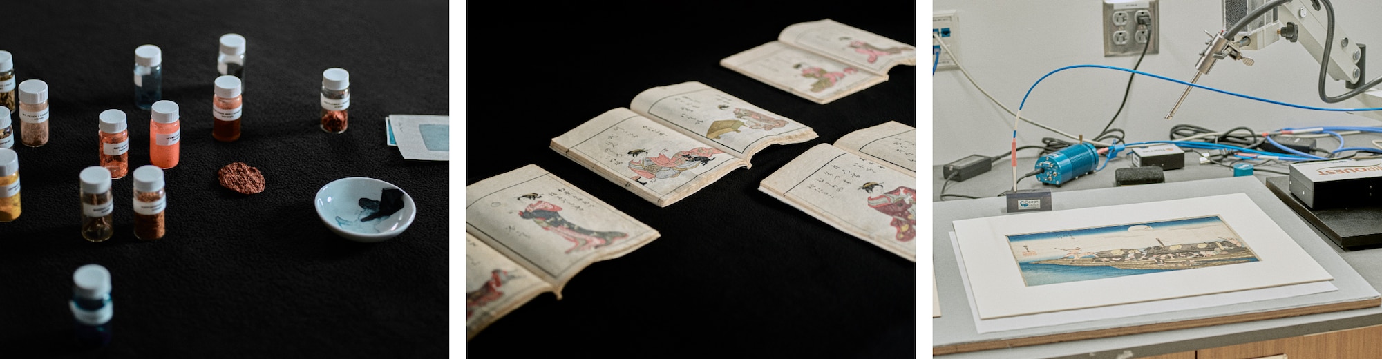
Left: As part of the Ukiyo-e Colorant Research that started in 1999, materials are studied and recreated to understand each colorants’ characteristics. Center: Suzuki Harunobu’s woodblock printed book The Beautiful Women of the Yoshiwara. Right: The fiber optics reflectance spectroscopy is part of the state-of-the-art technology used in the Scientific Research Laboratory housed inside the museum.
Ukiyo-e Highlights at the MFA Boston
Animals that fascinate us
Ukiyo-e captures the atmosphere and cityscapes of its time, portraying people’s daily lives as well as extraordinary moments through the distinctive styles of individual artists. Animals also appear throughout these works—from familiar creatures to exotic beings such as elephants, which were rare in Japan at the time. Sometimes anthropomorphized, sometimes rendered with playful charm, these animals seem to have sparked the artists’ imaginations. Take cats for example. Chosen for the latest UT collection is the battle scene of The War of Cats and Mice by Tsukioka Yoshitoshi. The instinctual enemies that are trapped in the perpetual chase I’m sure were all too familiar for the people of Edo, but the imagination here takes us into the flipped scenario. As the mice overpower the cats with tactics and prowess, the latter is captured rather in a state of panic. The climactic scene is boldly rendered on a T-shirt. Another work, Utagawa Kuniyoshi’s The Fifty-three Cats of the Ailurophile, features joyful caricatures of cats engaged in activities that are at once endearing and mischievous, celebrating the artist’s playful vision and boundless creativity. Each cat is labeled with names of Tokaido stations between Tokyo and Kyoto, performing the act of punning that Kuniyoshi implemented. At times forced, his sense of humor and an obvious love for cats screams out of this piece. Kuniyoshi’s careful composition with ability to let the creature dance with fluidity, is one of the reasons his work is regaining popularity as “people see the resemblance to things like Anime” proclaims Sarah, the curator of Japanese Prints at the Museum. “We actually acquired this piece fairly recently and haven’t had a chance to exhibit it yet. Kuniyoshi was famous for his cat prints, but we did not have many of them – as William Sturgis Bigelow’s collection makes up around sixty percent of the entire Ukiyo-e collection at the MFA Boston, my theory is that perhaps Bigelow preferred dogs more than cats?
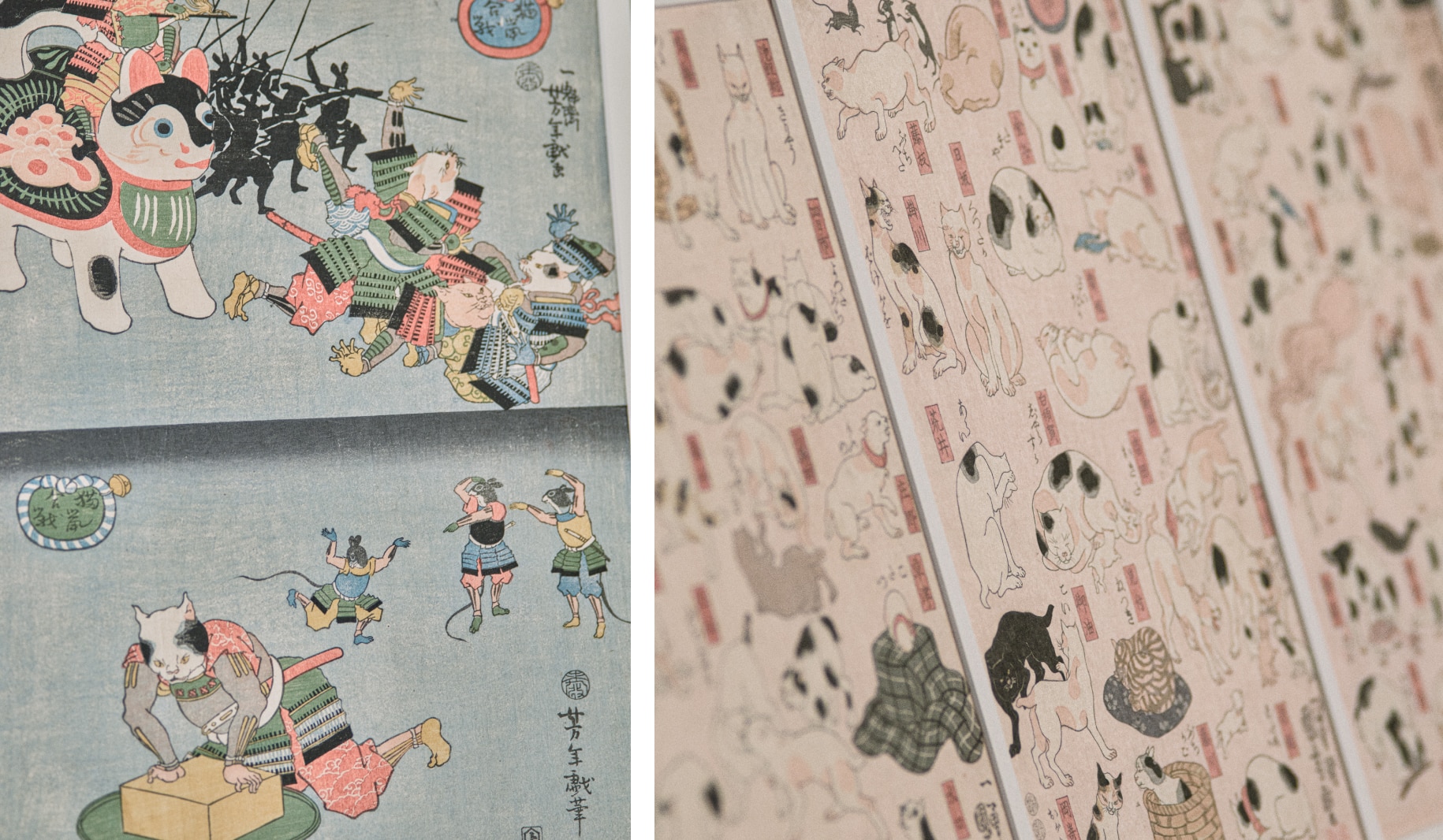
Left:The War of Cats and Mice, by Tsukioka Yoshitoshi. RIght: Utagawa Kuniyoshi, The Fifty-three Cats of the Ailurophile
Bigelow Collection
Museum of Fine Arts, Boston’s Ukiyo-e collection is comprised of prints from more than 200 donors and acquisitions. Boston is often quipped as a city of scholars with an effervescent presence of institutions like Harvard University and MIT, but the MFA Boston commands its own magnetic field. A Harvard graduate doctor and distinguished scholar of Japanese Art, Bigelow lived in Japan during the Meiji Era and upon return became a trustee of the MFA Boston, the tenure that lasted for 35 years. Ukiyo-e and beyond, Bigelow gifted around 75,000 pieces of Japanese art to the museum, making the institution a de facto authority on Japanese Art worldwide. He is also known for bringing in the scholar and art critic Okakura Tenshin, allowing for the context of the collection to properly establish itself in the Museum and the art world. “This year marks the 00th anniversary of his passing, and we are currently working on an exhibition about Bigelow.” The MFA Boston’s Ukiyo-e collection can be experienced through rotating exhibitions that change every six months. With the Edo Period’s (1603 – 1868) Ukiyo-e making up the predominant part of the collection, the colorants of the prints are mostly plant-based, making them especially susceptible to environmental damage. The museum has a dedicated Ukiyo-e room with a reimagined display philosophy since the arrival of conservator Joan Wright. Regardless, after each showcase, all pieces will be carefully put back in storage for at least 5 years, preferably more. Nothing is permanently displayed considering its sensitivity to light, adding more to the ephemeral beauty of Ukiyo-e known as “the art of the floating world.”
Museum of Fine Arts, Boston
Address: 465 Huntington Avenue, Boston, MA 02115, U.S.A.
Hours: 10am-5pm (Sat-Mon, Wed), 10am-10pm (Thu-Fri)
Closed: Tue, Jan 1, Patriots’ Day (3rd Mon in Apr), Jul 4, Thanksgiving (4th Thu in Nov), Dec 25
HP: https://www.mfa.org/
All items